Off the Charts: Your Favorite 5 Charts
IMF Blog, August 28, 2017
Source details
- Canonical URL
- Off the Charts: Your Favorite 5 Charts
Other formats
Bibliographic details
- Authors: The Editors
- Published: August 28, 2017
Overview
- Authors: The Editors
- Publication date: August 28, 2017
- Summary: Introduction to the Chart of the Week feature, described as "snapshots in time and over time of how economies work to help illuminate the uncharted waters ahead for the global economy."
- Visual note: (photo: iStock by Getty Images).
Purpose and framing
- Analogy: "Much as sailors use nautical charts to determine their location at sea, economists use charts to show who we are, where we are, and where we might be going."
- Initiative launch: "In the Spring, we began our Chart of the Week feature on the blog" to provide time-series and cross-sectional snapshots of economic phenomena.
Top five charts (ranked by readership)
- Chart of the Week: FDI in Financial Centers
- Chart of the Week: Electric Takeover in Transportation
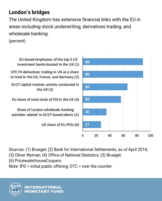
- Chart of the Week: Brexit and The City
- Chart of the Week: Iceland’s Tourism Eruption
- Chart of the Week: The Cost of Asia’s Aging
Source: Off the Charts: Your Favorite 5 Charts, The Editors, August 28, 2017.
References
- https://www.imf.org/wp-content/uploads/2017/08/BLOG-1024x600-image-of-charts-TOP5Charts-iStock-615507200.jpg
- Chart of the Week: FDI in Financial Centers
- https://www.imf.org/wp-content/uploads/2017/06/ENG_Jun_5_FDI_cotw-REV.jpg
- Chart of the Week: Electric Takeover in Transportation
- https://www.imf.org/wp-content/uploads/2017/07/ENG_Jul_18_COTW_horses_vs_cars-3.jpg
- Chart of the Week: Brexit and The City
- https://www.imf.org/wp-content/uploads/2017/05/Brexit-chart-used-in-blog.jpg
- Chart of the Week: Iceland’s Tourism Eruption
- https://www.imf.org/wp-content/uploads/2017/08/ENG_Aug_8_Iceland.jpg
- Chart of the Week: The Cost of Asia’s Aging
- https://www.imf.org/wp-content/uploads/2017/05/Chart_week_cht_050117-002.png